I found my wife Jennifer paging through one of my sample copies of Punk Rock Aerobics
Punk Rock Aerobics—the movement—was the brainchild of Maura Jasper and Hilken Mancini, who are veterans of the Boston music scene. Wanting to get in shape, but not wanting anything to do with gym membership, tan-in-a-can spandex-wearing step or spin gurus and their equally synthetic soundtracks, the girls decided to become certified aerobics instructors, so they could bring their own punk-inspired classes to the masses. Prior to inking their book deal with Da Capo in 2004, they had been profiled in local and national media, and had been teaching their exercise classes at the legendary Middle East, and had even taken their show on the road to CBGB, among other places.
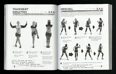
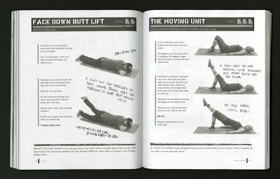
The challenge for me was to design a book that would be punk-derived and flyer-inspired, but also informative, instructional, and demonstrative, like a real exercise book—so, in other words, information design in ripped jeans and black lipstick.

One of the most important components were the step-by-step photographs, which were made in an exhausting 3-day shoot by Liz Linder, who has since become a great friend and collaborator on several other projects. Everyone on the shoot contributed, worked hard, and most importantly had a lot of fun (I mean, how could you not, really?).

In the case of Punk Rock Aerobics, it was definitely the first two conditions that were present and accounted for: good people and good—I think, at least—work (fun is good, right?). Liz probably took way to many photos for what she was paid, and I stole way too much time (on my publishing salary, no less) from other projects to art direct and design a book seen as having limited potential by the publisher. And everyone else involved, including musicians who came in to demonstrate moves for the camera (like J Mascis—pictured below, on the verso side—of Dinosaur Junior) gave freely of themselves.

The best part of projects with no budget and low expectations is that they are also typically rounded out with zero supervision. This allows a designer to editorialize, take ownership over the project, etc. AND to accept, when the authors ask you to appear as yourself in a "geek-to-freak" makeover sidebar (I guess they took me for some sort of nerd—wha?)!
Now when I said I found my wife "paging through", I meant that she was looking for this page in particular—she thinks it's cute (awww!), and that alone is worth way more than all the design awards this book never won!


This is funny! -Erin H.
ReplyDeleteI remember these commercials on The-N. THIS IS MY FAVORITE THING EVER!
ReplyDelete